
It doesn’t matter if you are doing a website yourself (DIY Website Design) or hiring a Web Strategist to design your web position, there are some important things to keep at mind — both as professional web aficionado or as a fresh WORLD WIDE WEB novice.
Don’t give people a toothache
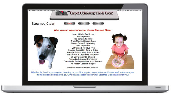
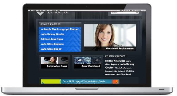
Kids and puppies are great images to use for your site if your business involves or encompasses children and/or animals….but if your business doesn’t, it’s not so appropriate.
If your images are too sweet and not reflective of your business, you are only making yourself look, exactly that, sweet and not the right fit.
Make sure when choosing photography for your site that it illustrates YOUR business or service. Ask yourself, have you ever bought a product or service because of the cute kid or doggie in the window?
Use photography poignantly
Your site’s photography gives a message about your business without saying — or reading — a word.
Photography can reinforce your brand, tell your audience what kind of business you are, illustrate scale (large or small business), even tell about your company culture. But misuse of photography will send mixed messages that will send the visitor to the back button and going forward with your competitor.
Organize your content
Many sites are very content driven…chock full of illuminating articles, informative links, educating whitepapers and highly involved product breakdowns….but what good is all this information if your visitors can’t find all this great information?
If people get confused, they leave…and all that great information is for not. Planning and organizing your site’s great content effectively can covert their interest/research into sales and/or action.
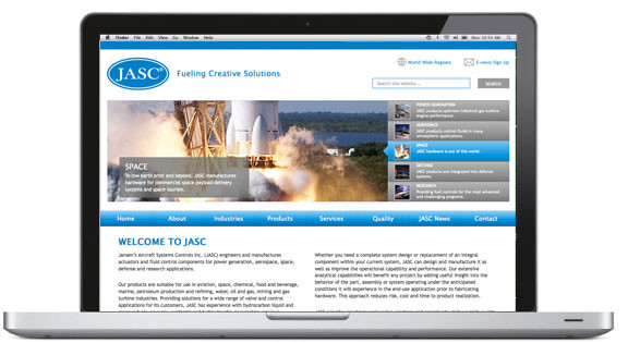
JASC has literally thousands of products, but with some great organizational breakdowns, all the products are easily navigatable; making it easier for customers — of all types — find exactly what they are looking for.
See more at jasc-controls.com
Brand everything
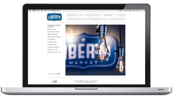
….even your photography. Take advantage of opportunities to use product or logo placement in photography and throughout your design whenever it’s possible or appropriate.
It’s not vanity…it’s your brand. And the more your clients….and possible new clients…see your branding the more they recognize and trust it, have it at top of mind, and the more they will use your product or service (aka sales).
See more at libertymarket.com
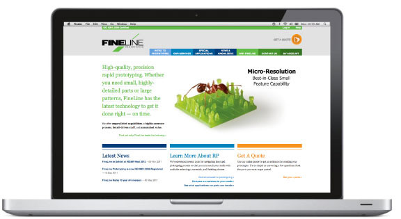
Don’t be afraid of color
Color can help segment a site that has a lot of content or bring life to more technical information. Color can also convey visual hierarchy, create dynamic composition, or put focus on an element or call to action.
Just make sure to use color carefully and stay within your branding. Adding color just for the sake of using color, can make your site look unfocused. There is psychology to color; use it wisely.
See more at finelineprototyping.com
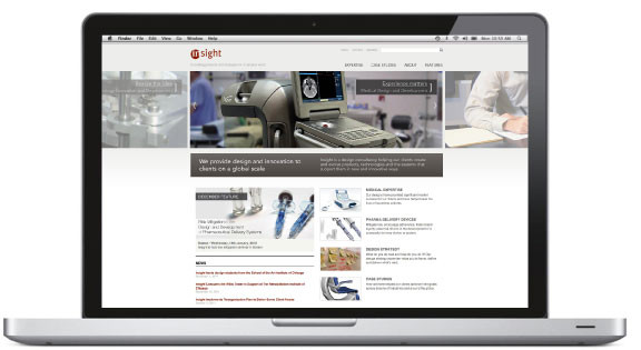
Show off what you got
The more illustrative you can be, the better! If your business is very technologically advanced or has some really great features, show them off.
Polished product photography can illustrate the professionalism of your company, while showing off all the bells and whistles of your product(s). It entices the viewer to interact and to covet your product. Its a one-two punch that very few consumers won’t swoon to.
See more at insight.com
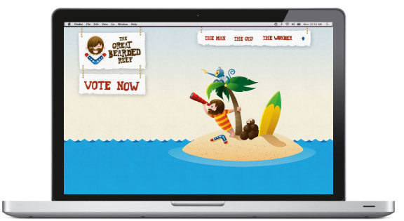
Don’t be afraid to point
Is there something in your website that you want people to look at? Point at it. Maybe not as literal as we see here with this little castaway and monkey, but notice the subtle arrow with the boomerang in the top left, “Great Bearded Reef” towards “VOTE NOW,” or the arrow created in the yellow and green surfboard pointing towards the sub-navigation.
Think of subtle ways you can direct your website’s visitors to where you want them to focus or how to navigate through your site.
See more at thegreatbeardedreef.com
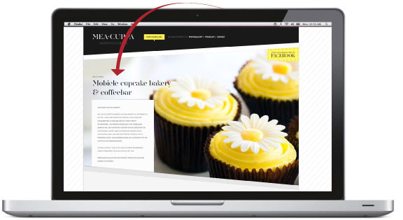
Make your company look bigger
Doesn’t this site look like something out of Martha Stewart Magazine? But did you notice that it’s a MOBILE cupcake and coffee bar? How much smaller business can you get than a TRAILER sized office?
This website conveys a highly organized, very high-end, highly editorial business that people would literally stalk for their next chocolate fix. Great design can make your business look larger and more reputable than you are, attracting a larger customer base…and more opportunities.
See more at meacuppa.be
Show the real you
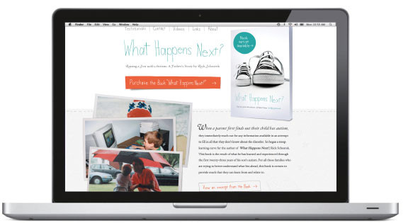
Candid pictures or a scrapbook style on your website can be a great way to create intimacy with your new (or current) customers.
If you are a very locally based business — show your favorite customers, show your employees loving their work, put a face to the (business) name. High end, glossy photography is not always needed to convey your message. Sometimes showing a
sincere reality can hook your customer base to your brand, service, or product.
See more at whathappensnextbook.com
Simplicity sells
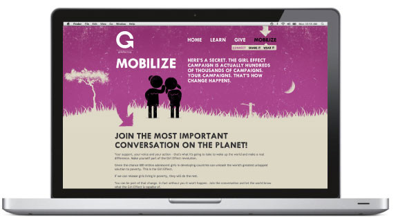
Beautiful graphics can make your website stand out in the webosphere. Photography isn’t always needed if you have great graphic visuals.
Graphics, like these, can be customized and can grow with your campaigns…they also don’t have to be terribly complex — simple, clean lines created these characters and carry the story.
See more at thegirleffect.org/question
Say it loud and clear
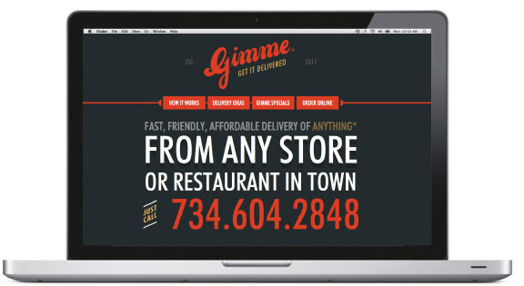
If it takes more than a few seconds for your website’s visitors to find their desired information, one of two things will happen….1. They get really frustrated with your site and grumble as they drudge through (or worse) 2. They get so frustrated they navigate away (to your competition) to find their desired information or service more easily.
Make sure your call to actions, navigation, and contact information are clear and easy to find. You may be loosing customers without it.
See more gimmedelivery.com
Play with your demographic
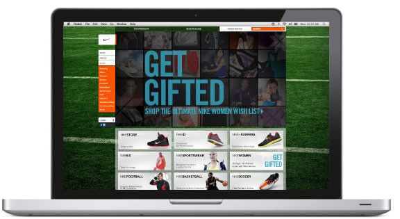
Many great websites use “plays” on their products, services, or business names to reinforce their brand. In this your viewer will “play” along with you and your business making a lasting impression.
So why not have fun with the idea of your business?
Play to your strengths, play to your audience, play to their interests…and in turn they will want to play with you.
Are you meeting their needs
Are your graphics/photography reinforcing your brand?
Is your website reflective of your business (through graphics, imagery, content)?
Does the visitor want/need information/service/products you are providing?
Does your content match your audience’s expectations?
Is your website a site that a potential or current customer will return to (2, 3, 4, or more times)? What will bring them back?
Is the content technically correct and up to date?
Can people find the content easily?

If you have any questions or comments please feel free to CONTACT US at Newhouse Studios and let us know your thoughts or leave a comment below. Download a printable version of this article.
Leave a Reply