Recently, MailChimp hero images became a real thing. Prior to the new hero image feature being added to MailChimp, you would have to create your background image with text over it in an image editing program and then import the image into MailChimp.
Not anymore.
Now, with the MailChimp hero image feature, you can add a background image to your email and you can type text directly over the image while in MailChimp. This feature can save all of us, even those of us who know and love Photoshop, a ton of time creating hero images (and editing and re-importing hero images when we realize there’s a typo).
Before we talk about how to use MailChimp’s hero image feature, let’s talk about something even more important: How do you get hero images to convert in email marketing?
Selecting a Hero Image for Your Email Marketing
Are you selling your knowledge?
If your website is about you, consider having you in your hero image with text. This approach is especially true if you are a coach or a public speaker and your target audience connects directly with who you are.
Are you selling a product?
If you can show your product in use by a person that looks like your ideal customer or better yet, by an animal that your ideal customer will find too adorable to ignore, you should take the extra effort to take custom photos.
Is your information more conceptual?
I have a tendency to use stock photos because my brand isn’t about me or about a physical product. It’s concepts I am teaching and the education is all about my audience, so I frequently choose images that reflect my ideal customer. I don’t mind being in my marketing a little bit, but I’m totally not the focus. Thus, I use stock images that I spend a lot of time selecting in order to convey a specific feel that’s in line with my target audience.
In any case, make your hero images unique to your brand by thinking about what your ideal audience resonates with the most. Ask yourself, “If my ideal customer saw the image in a social media feed or on a billboard, would they be attracted to it?”
Where to find stock images.
If you just can’t swing custom photos right now and need to go the way of stock photography, here’s a couple resources for you:
- iStockPhoto.com. This is a paid service that gives you access to extremely high-quality stock photos. They are by far not the most expensive or the least expensive. I like them because I usually don’t see my stock photos used in other places and they are continually adding to their selection.
- The Stocks. The stocks will give you tons and tons of free stock photography options.
Text on hero images
Your text color, font, and font weight on top of your hero image should be easily readable. Easily readable fonts on top of hero images usually are:
- Large. Bigger text is easier to read over details in the background.
- High Contrast. If you have an image with lots of light and dark spots in it, you might have a problem choosing a font color that works over all parts of the image. If this is the case, consider a different background image.
- Thick and Simple. Thicker, simpler fonts are easier to read than detailed fonts unless you have a simple background.
- Brief. Keep your text as brief as possible.
- Remember that target audience of yours? Where do they shop? What websites do they visit? Go check out those websites to get clues about font choices and image selection.
Examples of effective hero images:
Marie is a business coach. Her audience loves her. Her presence is a big part of her brand, so it makes a lot of sense that she is in the photos to promote her business. Notice that her text is easy to read. She has her text on the parts of the image that are solid fields of color. To make the font more readable, there is a semi-transparent solid color washing over the image.

Apple uses the most minimal text possible to get the point across and allow you to gaze adoringly at their product.

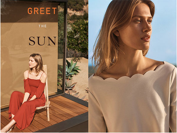
https://www.anthropologie.com/
Anthropologie shows their product on models that look like their ideal audience in settings that their ideal audience would be in. The font is large and in high contrast to the extremely simple background on which it sits.

Target is showing their products set up in a way that they think their target audience will find inviting rather than just showing sterile product shots. You can see that the products are actually in a room, yet the walls and floor are as low contrast as possible. The font, while not large, is placed in the simplest area of the image in a high-contrast color. The font is simple in structure, with no fancy embellishments or thin/thick lines; this allows the font to be small in size and remain legible.
